

Casa de ZENue: A Haven of Well-Being and the Essence of Our Visual Identity
It all begins with an idea.
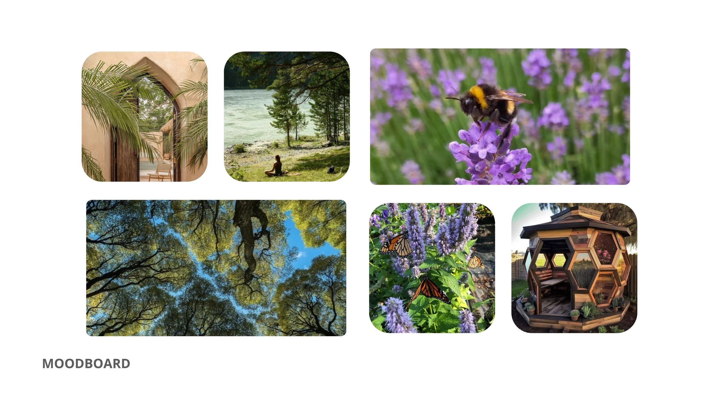
Casa de ZENue is more than a physical space; is a haven of peace, connection and transformation located in Vila de Cucujães, Portugal. This is where healers, therapists, and wellness seekers come together for holistic experiences that promote self-knowledge and healing. With a flexible infrastructure and carefully designed environments, Casa de ZENue offers an ideal setting for workshops, retreats and activities aimed at personal development and harmony with nature.
The Creative Process Behind Our Visual Identity
When it came time to create the graphic identity of Casa de ZENue, our mission was clear: to translate the welcoming, natural and transformative essence of the space into an image that conveys serenity and inspiration. We knew that our image needed to communicate the values of Casa de ZENue in an authentic and harmonious way, reflecting the well-being, nature and community that are so central to our proposal.

Graphic Elements Inspired by Nature 🌱
The choice of colors, shapes and graphic elements was carefully thought out to evoke a connection with nature. The deep blue tone of the letters "ZENue" conveys calm and depth, while the delicacy of the watercolor flower brings softness and a touch of life. The flower, positioned next to the word "ZEN", symbolizes the personal flourishing and harmony that we want to provide to our visitors.

Typography and Balance 🌿
We opted for a simple, modern typography with strong lines for the word "ZENue". This typographic style was chosen to communicate clarity and confidence, as well as harmonizing with the simplicity of Casa de ZENue's design. The word “Home of” in a soft lilac tone adds a touch of lightness, highlighting the idea that our home is a welcoming space of belonging, where everyone is welcome to explore and grow.
The Symbolism of the Flower ✨
The watercolor flower next to our name is one of the most significant elements of our identity. Inspired by nature, this flower represents renewal, ephemeral beauty and fragility that are essential aspects of the healing and growth processes. Furthermore, the watercolor style evokes softness and freedom, capturing the essence of an environment that promotes creativity and well-being..
Casa de ZENue: An Invitation to Flourish 🌸
The visual identity of Casa de ZENue is more than an image; it is a reflection of the values and energy we propose to offer. Every graphic element, color and detail was selected to create a feeling of calm, inspiration and welcome. We want people to feel the desire to reconnect with nature and themselves when they look at our brand, in a space where personal growth is encouraged and supported.
Come and discover Casa de ZENue and be part of this transformative community. We want everyone to feel at home here and discover the power of flourishing in harmony with nature and with themselves.

